Tuesday, May 28, 2013

Some Afterthoughts

When I came back home to Hamburg my husband was waiting for his dinner. I had made a good dinner the night before and we had leftover spareribs, coleslaw and some good bread. It didn't take very long to get it onto the table. Today, I decided to experiment with the screens that I had used for my demonstration. I printed a few green backgrounds and then printed the black screen on them. This time I used a Rives soft gray paper. Then on just a few I printed Overprint Varnish with the black screen. This will give just the black areas a shine and not change the color at all. It will give more of a contrast between the green and the black. In this photo the upper print has the varnish and the lower one doesn't. The varnish darkens the black ink and makes a better contrast with the soft green.

Then I decided to print some note cards with the screen for the black print. I had bought some cards and matching envelopes at AC Moore, on sale a while ago. I decided to print on those cards. I put some process magenta and some process cyan ink onto the screen, along with a lot of transparent base. The magenta was in the center of my screen and the cyan was at the outer edges. The squeegee would do the blending as I pulled it toward me. I printed a few on newspaper until I liked the look of it.
I liked the way that they looked. No two prints done this way will ever be exactly the same. I can always use note cards, or they make a good gift.

Memorial Day, 2013

On this glorious Memorial day, I went to East Aurora to give a demonstration for a Road Scholar group. I had taken many of my "proof books" - they show the steps in printing. Each screen print is made up of layers of ink printed one on top of the other. After explained how the stencil is made on the screens, I invited each participant to print the second color on a print that I had designed to print with just two colors and two screens. I had printed the green backgrounds and they were to print the black stylized flower design on top of the green rectangles on the Stonehenge print paper. I had cut each print paper 7" x 9" before I printed green. This will enable the print to fit nicely into an 8" x 10" ready made frame
Facilitator prints second color on the prints. Participants are holding the prints
that they had printed.

Friday, May 24, 2013

Presentation for "Roads Scholar" Group

On Memorial Day I will do a demonstration for a group who are attending a program about Roycroft , in East Aurora, NY . My husband and I have taken many Elderhostel programs from creating stained glass in West Virginia to studying wildlife in Alaska. Now, the name has been changed to Road Scholar, a not- for-profit organization that inspires adults to learn, discover and travel. Their learning adventures engage expert instructors, provide extraordinary access, and stimulate discourse and friendship among people for whom learning is the journey of a lifetime.

I took the first Elder hostel program that was held at Roycroft. I had always been interested in the Arts and Crafts Movement in the United States. I had the feeling of "coming home" whenever I went to East Aurora - I still feel that way. This has evolved into my creating art work that has the look and feel of Arts and Crafts. My screen prints are often of garden and field flowers arranged in Arts and Crafts collectible vases. I  may surround the print with related borders that reflect the friezes of the period.

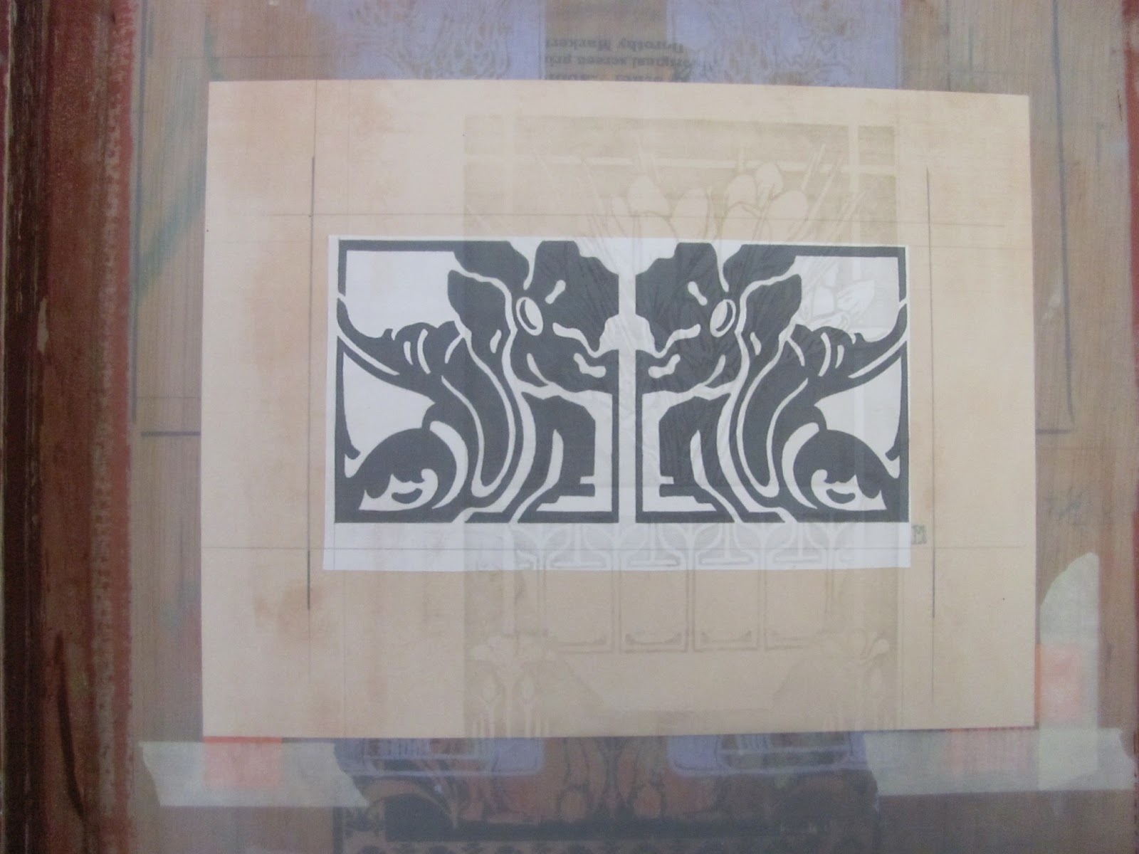
I have designed a print that follows Arthur Wesley Dow's design principals. When Dow died in 1922, he was called a great teacher. He had the knack for showing artists how to translate the poetry of nature into exquisite designs. For many, he was the single most influential teacher of arts and crafts in this country. This print will be made with two screens that are hinged to the same backing board.
design for print on a sheet of print paper.
This design will be printed in two colors. I will have the participants print the second color and they will be able to take their prints home with them. I will print the first color here in my studio.The edges of the green rectangle were deliberately hand painted with a brush as opposed to perfectly straight machine made edges. The contrast of the first and second colors is of primary importance for the design. The second color will be a mat black - it will contrast well with the soft green. I made the stencil for the green screen by tracing my layout lines with pencil onto the screen. Then I brushed the screen drawing fluid in that area onto the screen. After the drawing fluid dried, I spread screen filler across the entire screen. I let it dry and then using cold water, I removed the drawing fluid and was left with the stencil below.
Photo of image and screen used to print the first color (green)
with some prints, a squeegee, ink and other tools.
This design will be printed in two colors. I will have the participants print the second color and they will be able to take their prints home with them. I will print the first color here in my studio.The edges of the green rectangle were deliberativly hand painted with a brush as opposed to perfectly straight machine made edges. The contrast of the first and second colors is of primary importance for the design. The second color will be a mat black - it will contrast well with the soft green. I made the stencil for the green screen by tracing my layout lines with pencil onto the screen. Then I brushed the screen drawing fluid in that area onto the screen. After the drawing fluid dried, I spread screen filler across the entire screen. I let it dry and then using cold water, I removed the drawing fluid and was left with the stencil above.
Drawing fluid for first color.
 The second color will be black. I have prepared the screen for that. I carefully traced my original designwith screen drawing fluid. Dried the screen, spread the screen filler over all. I will show everyone how easily (I hope) the drawing fluid comes out of the screen and leaves the stencil for the second color. On Memorial Day, each person will get to print one for him/herself. I will remove the drawing fluid with cold water, dry the screen and have them print the second color.  I have added my initials in the bottom right hand side. 
Drawing fluid and screen filler for second stencil.


Tuesday, April 9, 2013

Quilted screen prints - presentation for South Town Piece Makers

Years ago, I printed quilt blocks. I had been making prints on paper for some time and I have always been a sewer. In 1978, I made a print on paper that incorporated images of this old community that began on Lake Erie, as a summer campground for wealthy families in Buffalo. There was a train station nearby making it possible for the men to commute into the city.  Each family had their own home, but they all ate together in a community dining hall. I worked with old photos from the Town of Hamburg historian, sketches that I made of a burned out house on the grounds and an old map of the area. At this time the only access to the area was an old rickety bridge that went over the 18 Mile Creek. The fire engines would not cross it. Many homes burned. The bridge has since been replaced. Idlewood is still there on the shore of Lake Erie in the Town of Hamburg. While I was printing the separate elements on paper, I decided to print some on fabric. I always had a lot old remnants from all of the sewing that I did. The next year, I put them all together to make this hanging. This was the start of my fabric art.

Idlewood Wall Hanging, 1907-1979
 In 2009, I found slides that I had taken of many of the pieces that I had made. 
I put them into a Power Point presentation and added that to my web site. 

In 1995 I became a Roycroft Renaissance Artisan. I have always been interested in the Arts and Crafts Movement. I devoted myself to printing works on paper  instead of fabric. To be honest, I was tired of all of the sewing - now I sew just for pleasure. Rag dolls and doll clothes were my next obsession as well as clothes for my four grand daughters. After that, I rid myself of tons of fabric scraps and sewing notions. My sewing room now features my collection of antique, toy sewing machines. I occasionally go up there to make some new curtains or do some mending.


Thursday, March 14, 2013

Pin Cherry and Sky


drawing for pin cherry and sky
 Years ago, when my neighbor was having a new garage built; I found a small  pin cherry tree  that was a volunteer along my fence line. I planted it and it stands in my back yard today.  I loved the way that the leaves, stems and small fruit look against the summer sky, I decided to make a print with the image. Playing with photo shop - I composed the image, eliminating the many of the branches that so intrigued me. Then I made a drawing that would fit into a 10 x 20 inch vertical frame.
reduction print
on black paper

I started by making a reduction print of the image.  - I had printed two onto black Stonehenge paper as well as 18 on white Stonehenge. I sort of liked the way that it looked, but after I had printed it, I realized that it needed some sort of background. I cleaned the screen and placed one of the prints, in register, under the screen and started to do a background for it.
before transparent pink
 I decided to add vertical lines that would emulate the cut lines of a wood block. I painted each line with screen drawing fluid, spread filler over all, washed out the drawing fluid and printed a light blue with  Speedball Textile Screen Printing Ink.
I sort of liked it - but I wasn't really happy with it. Just last week, I had an idea, I would print process magenta with a lot of transparent base over the whole print. That brought the print to life. The delicate lavender sky was just what it needed and it toned down the rest of the print, I was happy with it - but then I took another step and printed a very transparent process blue. I stopped after I had printed the transparent blue  over nine of the prints.
 It wasn't what I had expected - the transparent blue dulled the print - the nine that I had printed with blue will be Pin Cherry and Sky II - a different print.
with transparent blue-
Pin Cherry and Sky II

detail with transparent pink -
click on the images for a larger photo

Monday, December 3, 2012

New Coppershop Image

New Copper Shop Image
Old Copper Shop image


The first Copper Shop that I had made was just too wide to print on the roof tiles.

New Copper Shop print


The detail was lost when the image was reduced, and the trees are no longer there.

When I taught the class at the Power House back in October, I took some photos of the Copper Shop so that I could make a new print for the tiles. The new print will have the same words under neath. After I had made the black print for the tiles, I decided to make a multicolored print. A few years ago I had bought some Jacquard Screen Printing Ink - it was in metallic copper - I decided to use that for the roof and some of the detail. I printed on a craft colored paper that has darker flecks in it. I added dome detail to the background. I like the way the copper ink printed on the craft paper. 

The Copper Shop is dear to me. That is where there is a display of my work. I hope to take a few of the Copper Shop prints there next week. Right now, I am waiting for an order of mat board - I plan to mat this new print in black. I used two screens for this print. One has just the black image and the second was used to print copper and a darker shade of copper as a reduction print. The screens were both made with Speedball Drawing Fluid and Screen Filler. It was difficult to photograph this print, as the light reflected from the right hand side because of the metallic ink. I will go back to the campus and print the roof tiles with the new image - whenever.

Sunday, November 18, 2012

Results of rubbing class

close up
prints on fabric
the screen with crayola
The book she used

Here are some of the prints that my student made on Friday. She printed them on both paper and various colors of fabric. They were printed with black ink that had a little red that was blended into it with the squeegee. Click on the images for larger photos.
She picked a book, from my collection that I had never really used.
By moving the transparent screen she was able to select the area of the book for the rubbing. I think she did a remarkable design job.