Monday, April 14, 2014

Happy Easter


Going through my old art work, I came across an Easter Card that I made more than 10 years ago. It is a small accordion book. I particularly like the cover. I used a rubbing technique for this project. I printed with yellow, green, pink and blue (Easter egg colors) screen printing ink. For the cover, I printed a block of yellow and used the same opening for a rubbing ,which was printed with purple. I only found enough of these for my family - I will share this on Facebook for my friends.

Any textured surface can be used to create stencils that capture the look of the original surface. I often use antique, embossed book covers, dried flowers and leaves, ribbon and laces, coins and wood.
The screen is placed over the surface to be used. It is important to have a comfortable grip on the screen with one hand. Then with the other hand use a crayola crayon to make the rubbing directly on the screen. Don’t let the screen move, or you will have a double image.
The crayola will act as a block-out to the water base ink. The image will be the color of the paper and the area around it will be the color of the ink.
It is necessary to have a border of block-out around the rubbing. An open area on the screen can be made first and the rubbing can be done within it. I made Easter egg shapes with drawing fluid and screen filler and used floor finish for the different colors. 
When I use antique books, I cover them tightly with saran wrap to keep the crayon from getting on them. Dried flowers and leaves should not be too dry and brittle as they would crumble when rubbed.
After printing, clean the ink off with cold water. The crayon rubbing will stay on the screen. When cleaning the rubbing from the screen use hot water and a strong cleaner to remove the crayola. I used antique guide books from my collection for this project.

COVER


Thursday, October 10, 2013

How I Finished the Print

Print of Future floor finish screen
Using Future Floor Finish to make a Multicolored Print
drawing fluid on the screen

Thicken floor finish - I have been using thickened Future Floor Finish  It is now Pledge® Premium Finish with Future®Shine.(fff)for many of my recent prints. The Future is reduced on the stove. I put it into a pot, bring it to a boil, turn down the heat and then just let it simmer for about 1/2 hour or so. When I first put it into the pot, I measure it with a strip of mat board (or any cardboard) to see how deep it is. Then I mark the depth with a marker and use the strip to tell when it is about 1/2 the depth of when I started. Let it cool and put it back into its container.  You might think that you have ruined your cooking pot, but it cleans up completely with ammonia and warm water.

Making the screen filler Stencil - I start by using drawing fluid to cover all areas that are to be any color, sometimes this is just a rectangular block. Drawing fluid is painted onto the screen everywhere except where just paper will show, often this is just the margin around the image. Then I spread screen filler over the screen. I let it dry and wash out the drawing fluid with cold water. This leaves all of the areas of the design to be printed open on the screen.

Making the fff stencil - Then I start by painting all of the areas to be the first color with drawing fluid. When it is dry I cover the screen with prepared Future. I use almost the same technique that I use to spread screen filler. The screen is elevated above the table top and a small amount of Future is poured onto the blocked out area on the top of the screen. Then I take a strip of mat board and pull the wax across the image. I leave the mat board tilted against the bottom of the frame and quickly dry the image area with a hair dryer. The I turn the screen 180 degrees and pull the Future back across the screen in the opposite direction from the first time. I wipe off any heavy deposit of Future that is on the screen filler with a paper towel. Again I dry it with the hair dryer. It is important to work on just the top side of your screen for all the steps.

drawing fluid on screen
for second color
print from second screen
Removing the drawing fluid from a fff stencil- Let the screen dry thoroughly. In the winter I put it by a heat vent and out in the sunshine in the summer. When it is completely dry, I use a sponge and cold water to dissolve the drawing fluid and wipe down the screen. After it is dry again, any residue of Future in the print area will come off by using a bristle brush. The resulting stencil can then be printed with the first color, just like any other stencil. The Future stencil is more delicate than a screen filler one. You should not expect to wash the ink from it and print it again. After printing the first color, I wash the ink from the screen.  
     
Reduction stencil - I can use the existing stencil for a reduction stencil by painting drawing fluid into the open areas of screen wherever I want to print the second color. Spread another two coats of thickened fff over all and repeat the directions above. 
     
Removing the floor finish - After washing off the ink, I can remove the stencil by applying clear household ammonia (not sudsy) directly onto the screen and rinsing with cold water. This will remove the Future and leave the screen filler. Do not use detergent ammonia; it will remove the screen filler. 
     
 Additional fff stencils - When the screen is dry, drawing fluid is used again to create the stencil for the second color. This can be done either on the ammonia cleaned screen or as a reduction stencil in the openings in the fff that were made for the first color. 

Repeat the process for as many colors as you want to use.
This process can be combined with other techniques. 

I often use two screens, one has the outline and final color to be printed made with drawing fluid and screen filler. I print this on a paper glued down on the screen bed. Then, using that image as a guide I use the Future method on another screen for the colors that will be printed first. After printing all of the first colors, I print the stencil on the first screen on top of all of the rest.
The finished print
      A mask of screen filler can be used over again to make prints of the same size. It is easy to spread the Future on the small area that the screen filler leaves. It is easy to paint the drawing fluid onto the screen filler - you don't have to worry about getting it just on the right spot. The screen filler will ensure that it is in the right place.

Wednesday, October 9, 2013

How I Started My Print

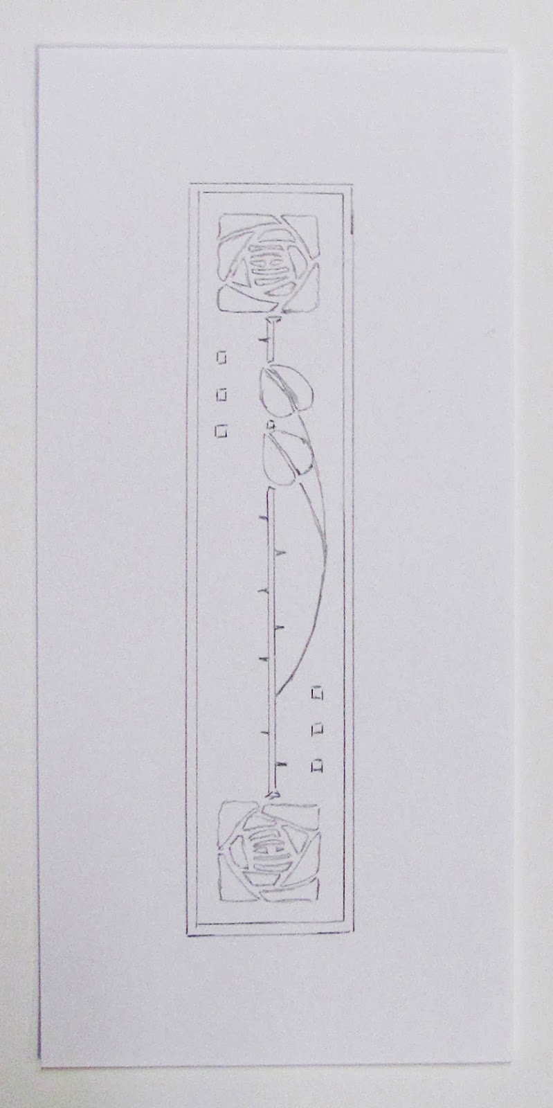
Pencil Drawing of Design

All of my prints start with an idea. I knew that the participants would be studying all about Roycroft.


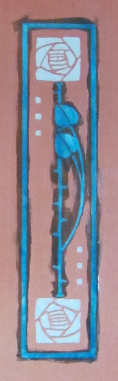
Dard Hunter was a significant member of the Roycroft team. The Roycroft Rose was inspired by Viennese fashion at the turn of the century.The square rose paired with a graceful stem has become his most recognizable design.

drawing fluid on screen
I had a lot of cut-offs from my Stickley series of prints. they were only 4" x 8 1/2" and the finished print is 1 1/2" x 6 1/4". The will allow a larger than usual margin around the matted print and show more of the special paper. I decided to use these cut-offs for this print. The drawing was made on a piece of white, print sized paper 4" x 8 1/2". Register guides were put in place, a clean screen was lowered onto the bed. The transparent screen allows me to see the drawing underneath. I painted everything that was to be any color onto the screen with Speedball Drawing Fluid after that was dry, I spread Speedball Screen Filler over the entire screen. Again, I had to wait for it to dry, then with cold water, I washed out the drawing fluid - this left just the screen filler to block out everything else - leaving openings in the screen for the ink to print.

I printed this screen with black  Speedball Waterbased Fabric Printing Ink
print from the screen

screen filler on screen
Later, I will tell you  how I printed the two colors with just the one screen using Future Floor Finish.
For more information please go to "My Manual" on my website.

Tuesday, October 8, 2013

Another Road Scholar Demonstration

Dard Hunter Rose
I have been asked to do a demonstration for this group who will be learning about Roycroft and the Arts and Crafts Movement. I will do another two color screen print. I will have the first color printed and let the participants print the second color.

I was inspired by the Dard Hunter Rose. A wonderful arts and crafts design created by the well known designer and hand made paper authority of the time - you can read about him  here.

In June of 1904, Dard applied for a summer position with Elbert Hubbard and the Roycrofters. He was denied employment but insisted he could do the job and in July he simply showed up at the artist's colony and was hired. Within a few months, he was designing stained glass windows in the Roycroft Inn and title pages for Hubbard's press.

 In 1908, Dard married Roycroft pianist Edith Cornell. At the time, he was so enamored with the work of Joseph Hoffman and the Wiener Werkstatte that they spent their honeymoon in Vienna. For the next few years, Hunter incorporated the geometric patterns and the highly stylized figures into his work with the Roycrofters. Hunter's designs for books, leather, glass and metal helped unify the Roycroft product line and distinguish it from other American Arts and Crafts enterprises.

The screen print above is the small, two color print that we will be making on Columbus Day. I have matted this one with a black, rag mat. It is on a recycled tan paper and in one of my husband's hand made walnut frames. The Road Scholar group will print the orange rose and the three orange squares. They will be able to take their prints home with them. I hope that they will experience what goes into a handmade print from the inspiration, to the design and care in production to the actual presentation of the finished work.


Tuesday, July 9, 2013

Classes in July, in my basement studio

I have two classes scheduled for July here in my home in Hamburg. I will have two students in each class. There isn't any much room in my small work space. They will bring a brown bag lunch and I will have cookies and iced tea on hand for them.
The design that you will print is limited to 7” x 10” . It could be smaller, but not any larger. I will have a many copies of suitable copyright-free Arts and Crafts images that you could use.


But you may have other ideas.  My print “Tommy” on the left was made from a pencil sketch from years ago. It could also have been made from a photo.


 “The Colden Mill” (below)
was made from an old photo that had very good contrast. 
      
“New York State Grapes” (above) was made from a photocopy of an antique label.
Any subject will work. You may have an image in mind. Photos need to have strong contrast. The copy machine will increase contrast. You will need at least one good photocopy of your subject. This can be reduced or enlarged to the size of your finished print. Be sure to bring along the original photo or art work when you come to class.  

       We will be printing on white and colored card stock as well as a fine quality “Stonehenge” 100% rag paper. If you have paper that you would like to try printing on – bring it with you. It should be no larger than 9” x 12”. You could also bring a light colored new or old t-shirt (poly/cotton is fine) to print on.

You will actually be tracing your photocopy onto the transparent screen to make your print which is why the photocopy of your image will be the size of the finished print.

We will be printing in just one color. I will have a small assortment of colors available as well as black. If you want a special color just let me know. I will demonstrate how to print additional colors.

Don’t wear your best clothes, the inks are permanent.  

Tuesday, May 28, 2013

Some Afterthoughts

When I came back home to Hamburg my husband was waiting for his dinner. I had made a good dinner the night before and we had leftover spareribs, coleslaw and some good bread. It didn't take very long to get it onto the table. Today, I decided to experiment with the screens that I had used for my demonstration. I printed a few green backgrounds and then printed the black screen on them. This time I used a Rives soft gray paper. Then on just a few I printed Overprint Varnish with the black screen. This will give just the black areas a shine and not change the color at all. It will give more of a contrast between the green and the black. In this photo the upper print has the varnish and the lower one doesn't. The varnish darkens the black ink and makes a better contrast with the soft green.

Then I decided to print some note cards with the screen for the black print. I had bought some cards and matching envelopes at AC Moore, on sale a while ago. I decided to print on those cards. I put some process magenta and some process cyan ink onto the screen, along with a lot of transparent base. The magenta was in the center of my screen and the cyan was at the outer edges. The squeegee would do the blending as I pulled it toward me. I printed a few on newspaper until I liked the look of it.
I liked the way that they looked. No two prints done this way will ever be exactly the same. I can always use note cards, or they make a good gift.

Memorial Day, 2013

On this glorious Memorial day, I went to East Aurora to give a demonstration for a Road Scholar group. I had taken many of my "proof books" - they show the steps in printing. Each screen print is made up of layers of ink printed one on top of the other. After explained how the stencil is made on the screens, I invited each participant to print the second color on a print that I had designed to print with just two colors and two screens. I had printed the green backgrounds and they were to print the black stylized flower design on top of the green rectangles on the Stonehenge print paper. I had cut each print paper 7" x 9" before I printed green. This will enable the print to fit nicely into an 8" x 10" ready made frame
Facilitator prints second color on the prints. Participants are holding the prints
that they had printed.

Friday, May 24, 2013

Presentation for "Roads Scholar" Group

On Memorial Day I will do a demonstration for a group who are attending a program about Roycroft , in East Aurora, NY . My husband and I have taken many Elderhostel programs from creating stained glass in West Virginia to studying wildlife in Alaska. Now, the name has been changed to Road Scholar, a not- for-profit organization that inspires adults to learn, discover and travel. Their learning adventures engage expert instructors, provide extraordinary access, and stimulate discourse and friendship among people for whom learning is the journey of a lifetime.

I took the first Elder hostel program that was held at Roycroft. I had always been interested in the Arts and Crafts Movement in the United States. I had the feeling of "coming home" whenever I went to East Aurora - I still feel that way. This has evolved into my creating art work that has the look and feel of Arts and Crafts. My screen prints are often of garden and field flowers arranged in Arts and Crafts collectible vases. I  may surround the print with related borders that reflect the friezes of the period.

I have designed a print that follows Arthur Wesley Dow's design principals. When Dow died in 1922, he was called a great teacher. He had the knack for showing artists how to translate the poetry of nature into exquisite designs. For many, he was the single most influential teacher of arts and crafts in this country. This print will be made with two screens that are hinged to the same backing board.
design for print on a sheet of print paper.
This design will be printed in two colors. I will have the participants print the second color and they will be able to take their prints home with them. I will print the first color here in my studio.The edges of the green rectangle were deliberately hand painted with a brush as opposed to perfectly straight machine made edges. The contrast of the first and second colors is of primary importance for the design. The second color will be a mat black - it will contrast well with the soft green. I made the stencil for the green screen by tracing my layout lines with pencil onto the screen. Then I brushed the screen drawing fluid in that area onto the screen. After the drawing fluid dried, I spread screen filler across the entire screen. I let it dry and then using cold water, I removed the drawing fluid and was left with the stencil below.
Photo of image and screen used to print the first color (green)
with some prints, a squeegee, ink and other tools.
This design will be printed in two colors. I will have the participants print the second color and they will be able to take their prints home with them. I will print the first color here in my studio.The edges of the green rectangle were deliberativly hand painted with a brush as opposed to perfectly straight machine made edges. The contrast of the first and second colors is of primary importance for the design. The second color will be a mat black - it will contrast well with the soft green. I made the stencil for the green screen by tracing my layout lines with pencil onto the screen. Then I brushed the screen drawing fluid in that area onto the screen. After the drawing fluid dried, I spread screen filler across the entire screen. I let it dry and then using cold water, I removed the drawing fluid and was left with the stencil above.
Drawing fluid for first color.
 The second color will be black. I have prepared the screen for that. I carefully traced my original designwith screen drawing fluid. Dried the screen, spread the screen filler over all. I will show everyone how easily (I hope) the drawing fluid comes out of the screen and leaves the stencil for the second color. On Memorial Day, each person will get to print one for him/herself. I will remove the drawing fluid with cold water, dry the screen and have them print the second color.  I have added my initials in the bottom right hand side. 
Drawing fluid and screen filler for second stencil.


Tuesday, April 9, 2013

Quilted screen prints - presentation for South Town Piece Makers

Years ago, I printed quilt blocks. I had been making prints on paper for some time and I have always been a sewer. In 1978, I made a print on paper that incorporated images of this old community that began on Lake Erie, as a summer campground for wealthy families in Buffalo. There was a train station nearby making it possible for the men to commute into the city.  Each family had their own home, but they all ate together in a community dining hall. I worked with old photos from the Town of Hamburg historian, sketches that I made of a burned out house on the grounds and an old map of the area. At this time the only access to the area was an old rickety bridge that went over the 18 Mile Creek. The fire engines would not cross it. Many homes burned. The bridge has since been replaced. Idlewood is still there on the shore of Lake Erie in the Town of Hamburg. While I was printing the separate elements on paper, I decided to print some on fabric. I always had a lot old remnants from all of the sewing that I did. The next year, I put them all together to make this hanging. This was the start of my fabric art.

Idlewood Wall Hanging, 1907-1979
 In 2009, I found slides that I had taken of many of the pieces that I had made. 
I put them into a Power Point presentation and added that to my web site. 

In 1995 I became a Roycroft Renaissance Artisan. I have always been interested in the Arts and Crafts Movement. I devoted myself to printing works on paper  instead of fabric. To be honest, I was tired of all of the sewing - now I sew just for pleasure. Rag dolls and doll clothes were my next obsession as well as clothes for my four grand daughters. After that, I rid myself of tons of fabric scraps and sewing notions. My sewing room now features my collection of antique, toy sewing machines. I occasionally go up there to make some new curtains or do some mending.


Thursday, March 14, 2013

Pin Cherry and Sky


drawing for pin cherry and sky
 Years ago, when my neighbor was having a new garage built; I found a small  pin cherry tree  that was a volunteer along my fence line. I planted it and it stands in my back yard today.  I loved the way that the leaves, stems and small fruit look against the summer sky, I decided to make a print with the image. Playing with photo shop - I composed the image, eliminating the many of the branches that so intrigued me. Then I made a drawing that would fit into a 10 x 20 inch vertical frame.
reduction print
on black paper

I started by making a reduction print of the image.  - I had printed two onto black Stonehenge paper as well as 18 on white Stonehenge. I sort of liked the way that it looked, but after I had printed it, I realized that it needed some sort of background. I cleaned the screen and placed one of the prints, in register, under the screen and started to do a background for it.
before transparent pink
 I decided to add vertical lines that would emulate the cut lines of a wood block. I painted each line with screen drawing fluid, spread filler over all, washed out the drawing fluid and printed a light blue with  Speedball Textile Screen Printing Ink.
I sort of liked it - but I wasn't really happy with it. Just last week, I had an idea, I would print process magenta with a lot of transparent base over the whole print. That brought the print to life. The delicate lavender sky was just what it needed and it toned down the rest of the print, I was happy with it - but then I took another step and printed a very transparent process blue. I stopped after I had printed the transparent blue  over nine of the prints.
 It wasn't what I had expected - the transparent blue dulled the print - the nine that I had printed with blue will be Pin Cherry and Sky II - a different print.
with transparent blue-
Pin Cherry and Sky II

detail with transparent pink -
click on the images for a larger photo

Monday, December 3, 2012

New Coppershop Image

New Copper Shop Image
Old Copper Shop image


The first Copper Shop that I had made was just too wide to print on the roof tiles.

New Copper Shop print


The detail was lost when the image was reduced, and the trees are no longer there.

When I taught the class at the Power House back in October, I took some photos of the Copper Shop so that I could make a new print for the tiles. The new print will have the same words under neath. After I had made the black print for the tiles, I decided to make a multicolored print. A few years ago I had bought some Jacquard Screen Printing Ink - it was in metallic copper - I decided to use that for the roof and some of the detail. I printed on a craft colored paper that has darker flecks in it. I added dome detail to the background. I like the way the copper ink printed on the craft paper. 

The Copper Shop is dear to me. That is where there is a display of my work. I hope to take a few of the Copper Shop prints there next week. Right now, I am waiting for an order of mat board - I plan to mat this new print in black. I used two screens for this print. One has just the black image and the second was used to print copper and a darker shade of copper as a reduction print. The screens were both made with Speedball Drawing Fluid and Screen Filler. It was difficult to photograph this print, as the light reflected from the right hand side because of the metallic ink. I will go back to the campus and print the roof tiles with the new image - whenever.

Sunday, November 18, 2012

Results of rubbing class

close up
prints on fabric
the screen with crayola
The book she used

Here are some of the prints that my student made on Friday. She printed them on both paper and various colors of fabric. They were printed with black ink that had a little red that was blended into it with the squeegee. Click on the images for larger photos.
She picked a book, from my collection that I had never really used.
By moving the transparent screen she was able to select the area of the book for the rubbing. I think she did a remarkable design job.


Tuesday, November 13, 2012

Ready for Screen Filler

Three screens ready for filler
I rooted around and found some old screens that had images on then that I didn't want to use again and cleaned them up. Then I laid out the shapes on cross section paper - this will insure that they are square. I traced each shape onto the top side of the screen with a pencil. I found it easier to flip the screens over and paint the drawing fluid onto the under side. I used a ruling pen and a straight edge to put all of the lines onto the screens. Then I filled in the squares and rectangles with a brush and drawing fluid. I need to have openings in the screen for the rubbings. I added a 1/4" seam allowance around all - this will make it easier to cut out the fabric pieces. One of the screens has rectangles instead of squares so that they can be used as borders. Now I need to spread screen filler over the back side of the screens and let them dry before I wash out the drawing fluid.

With any type of printmaking, preparation and designing have to be thought about before the fun of making the prints. You have to have an idea of what the goal is and how to get there.

Monday, November 12, 2012

Book rubbings


"Book Purse" front
"Book Purse" -  
The photos on the left are from my web site on page 44 of the Power Point of Textile prints that I used to make. The piece called "Book Purse" was in a National Fiber Arts show. I don't have it any more.
Back in the 1980s, I went to the Hamburg Historical Society's Museum with some screens and crayola crayons; I made  book rubbings from their collection of antique, embossed book covers. The three in this piece are The Works of George Elliot on the front (complete with her portrait) and Dickens (another portrait) and Pope. I liked the look of these and also made designs of borders that would complete the purse.


STENCILS MADE WITH RUBBINGS
            Any textured surface can be used to create  stencils that capture the texture of the original surface. I often use antique, embossed book covers, dried flowers and leaves, ribbon and laces, coins and wood.
            The screen is placed over the surface to be used. It is important to have a comfortable grip on the screen with one hand. Then with the other hand use a crayola crayon to make the rubbing directly on the screen. Don’t let the screen move, or you will have a double image.
            The crayola will act as a blockout to the water base ink. The image will be the color of the paper and the area around it will be the color of the ink.
            It is necessary to have a border of blockout around the rubbing. An open area on the screen can be made first and the rubbing can be done in it. To reverse the print - to print the image rather than the background - screen filler can be spread over all. When it is dry the crayola can be removed with paint thinner.
            When I use antique books, I cover them tightly with saran wrap to keep the crayon from getting on them. Dried flowers and leaves should not be too dry and brittle as they would crumble when rubbed.
            After printing, clean the ink off with cold water. The crayon rubbing will stay on the screen. When cleaning the rubbing from the screen use hot water and a strong cleaner to remove the crayola. Or you can clean the crayola from the screen with paint thinner.

I will have more about rubbings soon as I will be teaching the technique to someone who took my last class at the Power House. She is very interested to learn about rubbings

Sunday, November 4, 2012

Last weekend

Erica's print

 A great Arts and Crafts design was printed by another student. First she printed lavender, then
green , black and an iridescent darker blue/green.
This was done on Stonehenge fawn paper - it is 100% rag and has a nice deckle edge.
All of the printed area was lavender in the first state. With screen drawing fluid,she painted everything except what would stay lavender for the second printing and printed green, then painted all of the black areas with drawing fluid, spread filler over all - removed the drawing fluid and printed black. Within the black areas she added iridescent blue/green lines that complete the print.
There is so much repetitive work - painting on the screen with drawing fluid, drying, spreading the filler,
drying, removing the drawing fluid, drying and then
printing - the printing is really fun!
No two prints are exactly the same - they are all originals

Tuesday, October 30, 2012

Weekend class at the Power House

First two colors printed
The final print - four colors
There were only four students in this class. Kathy, on the right came from the Cleveland, Ohio area and stayed at the Inn.Click on the photos to see them larger.
We worked on reduction screen printing, which is also called the suicide method - because you can never go back. It is a difficult concept, but the only way to make a print with just one screen, using the drawing fluid and screen filler method. I had tried to explain the process on previous blogs. Everything that is to be any color in the print has to be included in the first stencil printed with the screen. Then by layering colors over the first color, wherever the stencil is open, the print can be completed. Good registration is so important and she did a great job. In the photo on the left only two colors have been printed, on the right two more colors have been printed on the darker gray and a soft dark red in just two spots, over the blue - a Santa hat and a Solo cup.

Friday, October 19, 2012

My Class on Oct. 27 & 28 at the Power House

Here is a link for my class, I am looking forward to being on the campus for two days and teaching screen printing. I will have some ideas along for prints at the Power House, but hopefully my students will come with an idea of what they want to do.
We will be making a small edition of prints (12) in this class.We will be using a reduction technique in which the printed area gets smaller for each color that is printed. The unprinted paper can be one of the colors. The print paper will be 9” x 12” and the image should be no larger than 7” x 10”. You could use a copier to size an image. I will have some suitable designs at the class; but it is better to print something you have a feeling for. You can work from your own sketch, photograph or a composite of pasted up images. The finished print will be the same size as whatever you are working from. From now on I will refer to this as the working drawing. If you use a photograph, get a good photocopy of it enlarged to the size of your finished print and keep the original handy to refer to. You can use a copier to enlarge or reduce whatever images you want to use. Plan to have at least a one inch margin around your print. I have  a photo of a reduction print below.
It was printed with light blue, dark purple, black and iridescent blue.  You could plan to print about 4 colors ( + or -). I’m looking forward to our class. http://roycroftprintmaker.blogspot.com/2012/08/the-first-step.html. This link to my screen printing blog will give you some idea of how this works. “Another try at a reduction print” – start with “The fourth and Final Color” and the blog will take you through the process.
E's Trees - sketch through 4th color

Here is a link to a site that shows a different reduction method. She paints on the screen filler directly on the screen instead of using drawing fluid and filler as I do.   http://ilovesmesomeart.livejournal.com/610.html
We could try doing that too.

Thursday, October 18, 2012

Roycroft Conference


You are invited to come to western NY and the Roycroft Campus for an intellectually and aesthetically stimulating weekend, just as it was in Elbert Hubbard's time.You are invited to come to western NY and the Roycroft Campus for an intellectually and aesthetically stimulating weekend, just as it was in Elbert Hubbard’s time. A wine tasting evening, artisan demonstrations, Campus architectural tours, a delicious organic dinner, and lectures spanning topics from Rosicrucianism to Dard Hunter’s graphic designs and restoration of the Roycroft Inn murals are set in the quaint Village of East Aurora while the fall foliage colors are at their finest. 
 The conference schedule and registration form are on the Roycroft Campus Corporation website. 
I am not going to participate in the conference because I have a two day class scheduled for the following weekend and I'm not up to two weekends in a row.
by Laura Wilder

However, the tiles that I printed will be there and my friend, Laura Wilder will be having an exhibit in the Power House and giving a talk about her block printing experience. Block printing is similar to screen printing as the prints are built up in layers.

Friday, October 12, 2012

Tiles have been printed

 Printed tiles at the Power House
The tiles have been printed - because they are so heavy, I printed them right at at the Power House on the Roycroft Campus. I didn't want to haul them home, down and up my basement stairs and cart them back to the campus. The three designs were printed with black acrylic ink onto the terra cotta tiles. They will be available at the Roycroft Conference, October 18-21.

After I made the photographic screens, I screwed some wood strips to the backs in one corner for registration. I had to clamp each screen to the tile before I printed them - the tiles are not really flat and I had to pull the squeegee in two directions to get the image printed. I did this right after I made a presentation to a Roads Scholar group, telling them about
screen printing. I demonstrated by printing the last color on a multicolored print using two screens.

Tuesday, September 25, 2012

Tile design for the Roycroft Power House

This is an original image that I made to print the tiles that will have the Roycroft Power House on them.

I didn't feel as if the print below that I had made for the presentation book would be the right format for this project.

I found a photo from the opening night on the web and made a new print of it.

The angle of the building and the setting were more in keeping with the other two images that I had made of the Chapel and the Copper Shop.


print in presentation book
After making the image, I printed it in black, scanned it, added the words and made and made a photo screen from a transparency that I printed with my laser printer from my computer.

Now, I have the three screens ready to print.
I am just waiting for the staff at the RCC to get the tiles cleaned and I will go over to the Power House where I will print them. They will be printed on the terra cotta tiles with black acrylic ink.


Here are the other two designs that I made for the photo screens.