Monday, December 3, 2012

New Coppershop Image

New Copper Shop Image
Old Copper Shop image


The first Copper Shop that I had made was just too wide to print on the roof tiles.

New Copper Shop print


The detail was lost when the image was reduced, and the trees are no longer there.

When I taught the class at the Power House back in October, I took some photos of the Copper Shop so that I could make a new print for the tiles. The new print will have the same words under neath. After I had made the black print for the tiles, I decided to make a multicolored print. A few years ago I had bought some Jacquard Screen Printing Ink - it was in metallic copper - I decided to use that for the roof and some of the detail. I printed on a craft colored paper that has darker flecks in it. I added dome detail to the background. I like the way the copper ink printed on the craft paper. 

The Copper Shop is dear to me. That is where there is a display of my work. I hope to take a few of the Copper Shop prints there next week. Right now, I am waiting for an order of mat board - I plan to mat this new print in black. I used two screens for this print. One has just the black image and the second was used to print copper and a darker shade of copper as a reduction print. The screens were both made with Speedball Drawing Fluid and Screen Filler. It was difficult to photograph this print, as the light reflected from the right hand side because of the metallic ink. I will go back to the campus and print the roof tiles with the new image - whenever.

Sunday, November 18, 2012

Results of rubbing class

close up
prints on fabric
the screen with crayola
The book she used

Here are some of the prints that my student made on Friday. She printed them on both paper and various colors of fabric. They were printed with black ink that had a little red that was blended into it with the squeegee. Click on the images for larger photos.
She picked a book, from my collection that I had never really used.
By moving the transparent screen she was able to select the area of the book for the rubbing. I think she did a remarkable design job.


Tuesday, November 13, 2012

Ready for Screen Filler

Three screens ready for filler
I rooted around and found some old screens that had images on then that I didn't want to use again and cleaned them up. Then I laid out the shapes on cross section paper - this will insure that they are square. I traced each shape onto the top side of the screen with a pencil. I found it easier to flip the screens over and paint the drawing fluid onto the under side. I used a ruling pen and a straight edge to put all of the lines onto the screens. Then I filled in the squares and rectangles with a brush and drawing fluid. I need to have openings in the screen for the rubbings. I added a 1/4" seam allowance around all - this will make it easier to cut out the fabric pieces. One of the screens has rectangles instead of squares so that they can be used as borders. Now I need to spread screen filler over the back side of the screens and let them dry before I wash out the drawing fluid.

With any type of printmaking, preparation and designing have to be thought about before the fun of making the prints. You have to have an idea of what the goal is and how to get there.

Monday, November 12, 2012

Book rubbings


"Book Purse" front
"Book Purse" -  
The photos on the left are from my web site on page 44 of the Power Point of Textile prints that I used to make. The piece called "Book Purse" was in a National Fiber Arts show. I don't have it any more.
Back in the 1980s, I went to the Hamburg Historical Society's Museum with some screens and crayola crayons; I made  book rubbings from their collection of antique, embossed book covers. The three in this piece are The Works of George Elliot on the front (complete with her portrait) and Dickens (another portrait) and Pope. I liked the look of these and also made designs of borders that would complete the purse.


STENCILS MADE WITH RUBBINGS
            Any textured surface can be used to create  stencils that capture the texture of the original surface. I often use antique, embossed book covers, dried flowers and leaves, ribbon and laces, coins and wood.
            The screen is placed over the surface to be used. It is important to have a comfortable grip on the screen with one hand. Then with the other hand use a crayola crayon to make the rubbing directly on the screen. Don’t let the screen move, or you will have a double image.
            The crayola will act as a blockout to the water base ink. The image will be the color of the paper and the area around it will be the color of the ink.
            It is necessary to have a border of blockout around the rubbing. An open area on the screen can be made first and the rubbing can be done in it. To reverse the print - to print the image rather than the background - screen filler can be spread over all. When it is dry the crayola can be removed with paint thinner.
            When I use antique books, I cover them tightly with saran wrap to keep the crayon from getting on them. Dried flowers and leaves should not be too dry and brittle as they would crumble when rubbed.
            After printing, clean the ink off with cold water. The crayon rubbing will stay on the screen. When cleaning the rubbing from the screen use hot water and a strong cleaner to remove the crayola. Or you can clean the crayola from the screen with paint thinner.

I will have more about rubbings soon as I will be teaching the technique to someone who took my last class at the Power House. She is very interested to learn about rubbings

Sunday, November 4, 2012

Last weekend

Erica's print

 A great Arts and Crafts design was printed by another student. First she printed lavender, then
green , black and an iridescent darker blue/green.
This was done on Stonehenge fawn paper - it is 100% rag and has a nice deckle edge.
All of the printed area was lavender in the first state. With screen drawing fluid,she painted everything except what would stay lavender for the second printing and printed green, then painted all of the black areas with drawing fluid, spread filler over all - removed the drawing fluid and printed black. Within the black areas she added iridescent blue/green lines that complete the print.
There is so much repetitive work - painting on the screen with drawing fluid, drying, spreading the filler,
drying, removing the drawing fluid, drying and then
printing - the printing is really fun!
No two prints are exactly the same - they are all originals

Tuesday, October 30, 2012

Weekend class at the Power House

First two colors printed
The final print - four colors
There were only four students in this class. Kathy, on the right came from the Cleveland, Ohio area and stayed at the Inn.Click on the photos to see them larger.
We worked on reduction screen printing, which is also called the suicide method - because you can never go back. It is a difficult concept, but the only way to make a print with just one screen, using the drawing fluid and screen filler method. I had tried to explain the process on previous blogs. Everything that is to be any color in the print has to be included in the first stencil printed with the screen. Then by layering colors over the first color, wherever the stencil is open, the print can be completed. Good registration is so important and she did a great job. In the photo on the left only two colors have been printed, on the right two more colors have been printed on the darker gray and a soft dark red in just two spots, over the blue - a Santa hat and a Solo cup.

Friday, October 19, 2012

My Class on Oct. 27 & 28 at the Power House

Here is a link for my class, I am looking forward to being on the campus for two days and teaching screen printing. I will have some ideas along for prints at the Power House, but hopefully my students will come with an idea of what they want to do.
We will be making a small edition of prints (12) in this class.We will be using a reduction technique in which the printed area gets smaller for each color that is printed. The unprinted paper can be one of the colors. The print paper will be 9” x 12” and the image should be no larger than 7” x 10”. You could use a copier to size an image. I will have some suitable designs at the class; but it is better to print something you have a feeling for. You can work from your own sketch, photograph or a composite of pasted up images. The finished print will be the same size as whatever you are working from. From now on I will refer to this as the working drawing. If you use a photograph, get a good photocopy of it enlarged to the size of your finished print and keep the original handy to refer to. You can use a copier to enlarge or reduce whatever images you want to use. Plan to have at least a one inch margin around your print. I have  a photo of a reduction print below.
It was printed with light blue, dark purple, black and iridescent blue.  You could plan to print about 4 colors ( + or -). I’m looking forward to our class. http://roycroftprintmaker.blogspot.com/2012/08/the-first-step.html. This link to my screen printing blog will give you some idea of how this works. “Another try at a reduction print” – start with “The fourth and Final Color” and the blog will take you through the process.
E's Trees - sketch through 4th color

Here is a link to a site that shows a different reduction method. She paints on the screen filler directly on the screen instead of using drawing fluid and filler as I do.   http://ilovesmesomeart.livejournal.com/610.html
We could try doing that too.

Thursday, October 18, 2012

Roycroft Conference


You are invited to come to western NY and the Roycroft Campus for an intellectually and aesthetically stimulating weekend, just as it was in Elbert Hubbard's time.You are invited to come to western NY and the Roycroft Campus for an intellectually and aesthetically stimulating weekend, just as it was in Elbert Hubbard’s time. A wine tasting evening, artisan demonstrations, Campus architectural tours, a delicious organic dinner, and lectures spanning topics from Rosicrucianism to Dard Hunter’s graphic designs and restoration of the Roycroft Inn murals are set in the quaint Village of East Aurora while the fall foliage colors are at their finest. 
 The conference schedule and registration form are on the Roycroft Campus Corporation website. 
I am not going to participate in the conference because I have a two day class scheduled for the following weekend and I'm not up to two weekends in a row.
by Laura Wilder

However, the tiles that I printed will be there and my friend, Laura Wilder will be having an exhibit in the Power House and giving a talk about her block printing experience. Block printing is similar to screen printing as the prints are built up in layers.

Friday, October 12, 2012

Tiles have been printed

 Printed tiles at the Power House
The tiles have been printed - because they are so heavy, I printed them right at at the Power House on the Roycroft Campus. I didn't want to haul them home, down and up my basement stairs and cart them back to the campus. The three designs were printed with black acrylic ink onto the terra cotta tiles. They will be available at the Roycroft Conference, October 18-21.

After I made the photographic screens, I screwed some wood strips to the backs in one corner for registration. I had to clamp each screen to the tile before I printed them - the tiles are not really flat and I had to pull the squeegee in two directions to get the image printed. I did this right after I made a presentation to a Roads Scholar group, telling them about
screen printing. I demonstrated by printing the last color on a multicolored print using two screens.

Tuesday, September 25, 2012

Tile design for the Roycroft Power House

This is an original image that I made to print the tiles that will have the Roycroft Power House on them.

I didn't feel as if the print below that I had made for the presentation book would be the right format for this project.

I found a photo from the opening night on the web and made a new print of it.

The angle of the building and the setting were more in keeping with the other two images that I had made of the Chapel and the Copper Shop.


print in presentation book
After making the image, I printed it in black, scanned it, added the words and made and made a photo screen from a transparency that I printed with my laser printer from my computer.

Now, I have the three screens ready to print.
I am just waiting for the staff at the RCC to get the tiles cleaned and I will go over to the Power House where I will print them. They will be printed on the terra cotta tiles with black acrylic ink.


Here are the other two designs that I made for the photo screens.

Tuesday, September 4, 2012

the Copper Shop

On the Roycroft Campus, edition of 50, 2006
This is the print that I will use for the Copper Shop tiles. I will use only the screen print that was used to make the darkest color in this print

This is a print that I had made back in 2006. I created the darkest image with drawing fluid and screen filler. then I printed it onto a sheet of paper that was glued down to the screen bed. This would be my guide to create the stencils for the other two colors. I used a second screen to make a reduction print of the two other colors. The Stonehenge paper (Fawn) would serve as the lightest value in the print. A coppery light terra cotta color would be the lighter, medium color and a warm gray-brown would be on the roof and some of the shadows. After I had printed those colors, I replaced the screen with the first screen that I had made and printed a very dark brown on top of the other colors. I feel as if this print captures the look and feel of the Copper Shop, with it's front gardens and the great, sheltering tree. This building was built in 1902 as the original blacksmith shop and later became the copper shop. I have been fortunate enough to have been a member of the Roycroft Campus Corporation
ever since it started. I have taught screen printing classes there in the Copper Shop and now have one scheduled for October 27 & 28. This will be the weekend after the Arts and Crafts Conference, Oct. 18 - 21,2012 in East Aurora, NY. I have had a semi-permanent display of my original screen prints in the Copper Shop Gallery for many years. The image that I will use for the Copper Shop on the tiles will be the darkest-first screen that I made for this print

Sunday, September 2, 2012

The Second Tile - The Copper Shop

The second tile will be an image of  the Copper Shop. This is the gallery of Arts and Crafts style furniture, books, pottery, stained glass and all sorts of artisan made work. I have been very pleased to have had a semi-permanent exhibit of my prints in the gallery even before the Roycroft Campus Corporation bought it.

The Copper Shop - built 1902
Back when Kitty Turgeon owned the "Roycroft Gift Shop" she had my prints in the shop for sale. I have always loved all things Roycroftie and took the first Elderhostel that was held on the campus. That was when Kitty saw my work and asked me to have a show of them in her shop. Screen printing was never an Arts and Crafts technique, but I felt that my process of painting the original images directly on the screen and doing all of the rest of the printing work myself fit the arts and crafts criteria perfectly. Later, Kitty suggested that I apply for the Roycroft Renaissance Mark.
I was awarded that privilege and for years I participated in the indoor and outdoor shows with the RALA group. I was even the mark chairman for 4 years and I designed two posters for the summer festivals.
A few years ago, I made a print of the Copper Shop. It was made with about four colors. I used two screens, one had a line drawing of the building and the other was used to make a reduction print with all of the colors other than the line drawing. First, I printed all of the colors and then printed the line drawing on top of them. This image is the line drawing of the Copper Shop - I will use it to print tiles that were recently removed from the building and replaced with new terra cotta tiles from the Boston Valley Pottery. 

Monday, August 27, 2012

New project

Roycroft Chapel, East Aurora, NY - built in 1899
The last time that I took some new art work over to the Copper Shop Gallery the director of the Roycroft Campus Corporation, Christine Peters told me that she had an idea of what could be done with the terracotta tiles that had been replaced from the roofs of some of the original buildings on the Roycroft Campus. I was asked to screen print images onto the flat side of the tiles. I am interested in doing this and took a tile home to try to print on.

My textile ink (an acrylic ink) seemed to work quite well. The tiles all have a slight dip in the center and I needed to pull the squeegee in two directions to be able to print in the dip. This worked well because I had clamped the screen in place on the tile.

Power House Book
I found an image of the Roycroft Chapel that I had made when I was printing a lot on fabric. These were all one color prints as I cannot register more colors on fabric - or on tiles. I will plan to make photographic screens screens of the Chapel, the Copper Shop and the Power House. The lettering on the screens can be done by using computer fonts, incorporating them into my designs. I have made a print of the Copper Shop that I can use and I have photos of the Power House and the multicolored print that I made of it last winter. I need to turn the Power House into a black and white image - originally it was made with light colors against black. This print was made to be in a presentation book, Linda Meyer did the calligraphy and Diane Bond bound it and made the covers.

Sunday, August 19, 2012

The fourth and final color

E's Trees" final on gray paper

The final color that I will print is iridescent blue topaz. I first printed the squiggly lines -  (branches/veins) with iridescent purple - but it looked too dark. Thanks to good registration, I was able to print blue topaz right over that.

Screen for fourth color
After cleaning the black ink from my screen and letting it dry - again. I painted screen drawing fluid onto the lines as indicated in my sketch.

You can see the screen shows all of the previous steps. The iridescent blue ink didn't come off the screen as well as the other colors. But when I cleaned the screen with Awsome and hot water, it all came off very well. Now I have a clean screen and I will have to decide what to do next.


Fourth color on white paper  -Fourth color on blue, purple and  black

Saturday, August 18, 2012

The third stencil

Drawing fluid for third stencil
The next color that I will print will be black. Again, with my original sketch underneath the screen, I painted drawing fluid wherever I wanted to have any additional colors. With the screen filler that is on the screen it is easy to see just where to paint the blue drawing fluid. I left space for the purple to show and painted the centers of the small triangles and into the lines at the top and bottom. I painted over the tree trunks, but not my initials. Then I repeated the steps of drying, spreading filler, drying, washing out the drawing fluid and drying again. The pattern is very evident at this point. Everything that is painted with the blue drawing fluid will be printed black.

You can see the outline of the print and the rectangular space on the screen - this was before I spread the filler for the third time.

This is the method that I will be teaching at the newly restored Power House on the Roycroft Campus on Sat & Sun, Oct 27 & 28. For more information click here.

Black printed                                                     Black, purple and light blue printed

Friday, August 17, 2012

Painting the second stencil

second screen
    After the screen was thoroughly dry, I replaced it onto the backer board and with the original sketch under the screen, I painted everything that was to be any additional color. Strips of mat board were laid under the screen to keep it separated from the sketch. I added little triangles and some lines into the borders and a cipher of my initials next to the trees. When dry, I went through the process of spreading filler, washing out the drawing fluid and drying again before I was ready to print the next color.
    The next color will be a dark purple - dark enough so that the trees read as solid when I print black over them.
    You can see the rectangle of dark red filler that will remain the paper color as well as the margins of the print. These enabled me to place my images in good relationship to the exposed paper.


Second color alone                                          and on top of first color


Thursday, August 16, 2012

Painting the first stencil

All of the steps that made this print
With my original sketch in register under the screen, I carefully drew pencil lines directly on the screen that would be the light blue area of the print. Then I painted everything that I wanted to be any color with screen drawing fluid.  I left a rectangular space that will remain the paper color. After the drawing fluid was dry and I checked it for pin holes, I spread screen filler over the whole screen. When that was dry, I washed away the drawing fluid, dried it again and printed 6 on a light gray rag paper and 4 on fawn Stonehenge. I also printed on some lighter white paper so that I could save all of  the steps. After printing light blue I washed the screen and let it dry again before going on with the next step. Here is a link to My Manual - it explains, in detail just how to do all of this.

Wednesday, August 15, 2012

The first step

original sketch
    The very first step was to create an image. I made a sketch that was inspired by some art deco trees by E. A. Seguy. His trees were made with a process called pochoir. Stencils were used for each color; building up to the finished art work.
    I scanned my sketch and re sized it. I took the upper part of the center tree and made vertical borders for the sides of my print.
    When I was satisfied with my design I mounted it onto a sheet of print paper, taped and centered it under the screen and placed three cardboard register guides onto the screen backer board.
     There are two register guides at the lower right hand corner and one near the top on the right side. These guides were glued down and taped so that the print paper butted right up to them. This insures that the registration will be perfect. I use a glue stick on the guides so that the print paper will not slide under them. 

Tuesday, August 14, 2012

Another try at a reduction print

finished print
original sketch

The print on the left hand side of this page is a true reduction print, printed in four colors and made with just one screen. The term "reduction" means that the printed area was reduced for each color . I used Speedball drawing fluid and screen filler to make the four stencils for this print. I will be posting the steps soon.

I just came across this quote that explains the process better than I could - "A screen print composed of images printed through a number of stencils can be extremely complex. All the stencil images must work together to make a final, single statement. This requirement is complicated by the fact that the finished statement is not revealed until the last stencil has been printed. Each stencil adds its own particular elements to the final effect. All stencils contribute some degree of modification, some more than others. The stencils are printed sequentially, one color at a time, one over the other. Each color is printed in turn on all copies in the edition before the next color is applied. Thus, the size of the edition cannot be increased after the second stencil has been printed..." Lawrence Rugolo, The Process of ScreenPrinting "

Wednesday, August 1, 2012

Finishing up my reduction print

green print
I wasn't completely happy with my print of Blossoms and Leaves. The petals of the blossoms were too flat. I decided to add some iridescent "Citrine" to bring more life to them. I cleaned the screen of the four layers of the reduction stencils.
I use "Awsome" that I buy at the dollar store, spray it on, leave the screen horizontal for 15 minutes and then spray with very hot water. I have an extra faucet on my laundry tub that is dedicated to a hose with a garden spray nozzle. I use a strong spray and the screen filler comes away, leaving the screen ready for my next step.
With a print, in register under the screen, I made a drawing fluid and screen filler stencil for some lines on the petals and printed some with the Citrine ink.
purple print
I like the way that they look. The petals on the purple print are darker and more orange that the ones on the green print -there is more contrast. The green print is more subtle.    

Of course, it is no longer a reduction print - which was the idea to start with. I think that I will try again to make a complete reduction print. That is the method that I will be teaching in October at the Power House on the Roycroft Campus.

The first thing that I need to do is to make a strong design for a reduction print - perhaps a landscape.
I'm not sure just what I will do. Maybe in the next few days, I will come up with something.

Tuesday, July 31, 2012

Emily's Cup Cakes

Emily
Emily's Cup Cakes
Here is my delightful grand daughter, Emily. She is a very careful, deliberate worker. She understood the process completely, mixed her own colors and printed in perfect registration. Emily started with an original line drawing of her cup cakes that she enlarged to be the size of her finished print. She started by making a drawing fluid and screen filler stencil that included every area she would print any color. From that point on she made Future stencils within the screen filler one. First she made a stencil for the lighter yellow, extending it into the frosting area. She painted drawing fluid onto this area, dried it, spread Future, dried it, removed drawing fluid with cold water, dried it and printed each piece of white Stonehenge paper with her lighter yellow ink. Then she cleaned the ink from the screen with cold water, dried it and made a reduction stencil within the light yellow stencil by painting drawing fluid onto the folds of the bottoms of the cup cakes (the little triangular areas), spread Future, dried, removed the drawing fluid, dried and printed each print with a darker color. After that was completed she removed the Future with clear
ammonia and cold water, dried the screen and proceeded to make four more Future stencils, first the light green, then blue, then pink.The green cup cake has blue and pink speckles on it. The screen was cleaned with ammonia after each - except for the pink stencil.  After printing  pink she made a reduction stencil to print a raspberry color on the on the pink raspberry and on the speckles green cup cake. Emily made a print of each color to keep as a record as well as the original drawing.

Monday, July 30, 2012

Teaching again

Grace's print

My daughter and grand daughter were here last week. I always love having them here. They both decided that they would like to make screen prints. Grace is a scenic artist for the Metropolitan Opera and Emily will be taking printmaking when she goes back to Mt. Holyoke College next semester.They have both done some screen printing here with me before this. Grace found a landscape sketch in one of my art books to work from. She is so very different from her daughter in the way that they work. Grace used many Future stencils after her original one made with screen filler. Her color sense is so well developed! I just love her print which she titled "July - At Home". She left #1 here for her father - I have matted it and will find a nice frame for it.
 Tomorrow, I will show you what Emily did.                                                                        

Friday, July 20, 2012

The fourth color

I have laid out some of the finished prints for this photo. I particularly like
green
purple
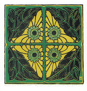
the green and the purple ones. The green ones have a real Arts and Crafts look. And I have always loved purple.  So here is a photo with the fourth color. On most of the green backgrounds I printed just a touch of iridescent green.     I mixed Citrine and Blue Topaz Speedball Opaque Iridescent Ink to get an iridescent green that I love. On all of the other prints I used Metallic Copper Jacquard Screen Printing Ink. I had to add water to the Jacquard ink as it was very thick.


I have another photo on the right of the screen that shows all of the layers that went into making this print. I put it on my light box to take the photo. The open yellow areas are where the 4th color was printed
Below, I  show how I painted drawing fluid to make the stencil for the iridescent and metallic colors.

Drawing fluid on 4th stencil

Now the third color

Drawing fluid for the third color
Here is a photo of the third stencil that I am making for this reduction print. With the original design under the translucent screen, I painted everything that was to be the third color. I went right over the leaf forms in the corners and the center of the blossoms. I carefully painted the lines separating the petals and painted the area around the center.

I decided that black ink would be the right color for this step. When I printed the black on all of the background colors - I was so excited that I forgot to photograph this step. I'm sorry.

Four colors have been printed
Here is a print of the third color alone.

Wednesday, July 18, 2012

The Second Color

 The second color printed
The photo on the left shows the first and second colors printed. I had to let the yellow that is over the green dry and print them again to get the intense yellow that I wanted. Yellow is very translucent and will not easily cover a dark color. I printed all of the rest in two shades of an orange/tan. It looks completely different over the yellow from those printed on blue. I printed a few without the first color onto fawn Stonehenge paper.

The two photos below show how I created the second stencil within the same stencil that I used to print the first.
Drawing fluid on screen for second color

Stencil for second color