 |
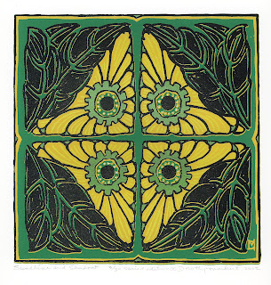
| green print |
I use "Awsome" that I buy at the dollar store, spray it on, leave the screen horizontal for 15 minutes and then spray with very hot water. I have an extra faucet on my laundry tub that is dedicated to a hose with a garden spray nozzle. I use a strong spray and the screen filler comes away, leaving the screen ready for my next step.
With a print, in register under the screen, I made a drawing fluid and screen filler stencil for some lines on the petals and printed some with the Citrine ink.
 |
| purple print |
Of course, it is no longer a reduction print - which was the idea to start with. I think that I will try again to make a complete reduction print. That is the method that I will be teaching in October at the Power House on the Roycroft Campus.
The first thing that I need to do is to make a strong design for a reduction print - perhaps a landscape.
I'm not sure just what I will do. Maybe in the next few days, I will come up with something.
No comments:
Post a Comment