Monday, August 27, 2012

New project

Roycroft Chapel, East Aurora, NY - built in 1899
The last time that I took some new art work over to the Copper Shop Gallery the director of the Roycroft Campus Corporation, Christine Peters told me that she had an idea of what could be done with the terracotta tiles that had been replaced from the roofs of some of the original buildings on the Roycroft Campus. I was asked to screen print images onto the flat side of the tiles. I am interested in doing this and took a tile home to try to print on.

My textile ink (an acrylic ink) seemed to work quite well. The tiles all have a slight dip in the center and I needed to pull the squeegee in two directions to be able to print in the dip. This worked well because I had clamped the screen in place on the tile.

Power House Book
I found an image of the Roycroft Chapel that I had made when I was printing a lot on fabric. These were all one color prints as I cannot register more colors on fabric - or on tiles. I will plan to make photographic screens screens of the Chapel, the Copper Shop and the Power House. The lettering on the screens can be done by using computer fonts, incorporating them into my designs. I have made a print of the Copper Shop that I can use and I have photos of the Power House and the multicolored print that I made of it last winter. I need to turn the Power House into a black and white image - originally it was made with light colors against black. This print was made to be in a presentation book, Linda Meyer did the calligraphy and Diane Bond bound it and made the covers.

Sunday, August 19, 2012

The fourth and final color

E's Trees" final on gray paper

The final color that I will print is iridescent blue topaz. I first printed the squiggly lines -  (branches/veins) with iridescent purple - but it looked too dark. Thanks to good registration, I was able to print blue topaz right over that.

Screen for fourth color
After cleaning the black ink from my screen and letting it dry - again. I painted screen drawing fluid onto the lines as indicated in my sketch.

You can see the screen shows all of the previous steps. The iridescent blue ink didn't come off the screen as well as the other colors. But when I cleaned the screen with Awsome and hot water, it all came off very well. Now I have a clean screen and I will have to decide what to do next.


Fourth color on white paper  -Fourth color on blue, purple and  black

Saturday, August 18, 2012

The third stencil

Drawing fluid for third stencil
The next color that I will print will be black. Again, with my original sketch underneath the screen, I painted drawing fluid wherever I wanted to have any additional colors. With the screen filler that is on the screen it is easy to see just where to paint the blue drawing fluid. I left space for the purple to show and painted the centers of the small triangles and into the lines at the top and bottom. I painted over the tree trunks, but not my initials. Then I repeated the steps of drying, spreading filler, drying, washing out the drawing fluid and drying again. The pattern is very evident at this point. Everything that is painted with the blue drawing fluid will be printed black.

You can see the outline of the print and the rectangular space on the screen - this was before I spread the filler for the third time.

This is the method that I will be teaching at the newly restored Power House on the Roycroft Campus on Sat & Sun, Oct 27 & 28. For more information click here.

Black printed                                                     Black, purple and light blue printed

Friday, August 17, 2012

Painting the second stencil

second screen
    After the screen was thoroughly dry, I replaced it onto the backer board and with the original sketch under the screen, I painted everything that was to be any additional color. Strips of mat board were laid under the screen to keep it separated from the sketch. I added little triangles and some lines into the borders and a cipher of my initials next to the trees. When dry, I went through the process of spreading filler, washing out the drawing fluid and drying again before I was ready to print the next color.
    The next color will be a dark purple - dark enough so that the trees read as solid when I print black over them.
    You can see the rectangle of dark red filler that will remain the paper color as well as the margins of the print. These enabled me to place my images in good relationship to the exposed paper.


Second color alone                                          and on top of first color


Thursday, August 16, 2012

Painting the first stencil

All of the steps that made this print
With my original sketch in register under the screen, I carefully drew pencil lines directly on the screen that would be the light blue area of the print. Then I painted everything that I wanted to be any color with screen drawing fluid.  I left a rectangular space that will remain the paper color. After the drawing fluid was dry and I checked it for pin holes, I spread screen filler over the whole screen. When that was dry, I washed away the drawing fluid, dried it again and printed 6 on a light gray rag paper and 4 on fawn Stonehenge. I also printed on some lighter white paper so that I could save all of  the steps. After printing light blue I washed the screen and let it dry again before going on with the next step. Here is a link to My Manual - it explains, in detail just how to do all of this.

Wednesday, August 15, 2012

The first step

original sketch
    The very first step was to create an image. I made a sketch that was inspired by some art deco trees by E. A. Seguy. His trees were made with a process called pochoir. Stencils were used for each color; building up to the finished art work.
    I scanned my sketch and re sized it. I took the upper part of the center tree and made vertical borders for the sides of my print.
    When I was satisfied with my design I mounted it onto a sheet of print paper, taped and centered it under the screen and placed three cardboard register guides onto the screen backer board.
     There are two register guides at the lower right hand corner and one near the top on the right side. These guides were glued down and taped so that the print paper butted right up to them. This insures that the registration will be perfect. I use a glue stick on the guides so that the print paper will not slide under them. 

Tuesday, August 14, 2012

Another try at a reduction print

finished print
original sketch

The print on the left hand side of this page is a true reduction print, printed in four colors and made with just one screen. The term "reduction" means that the printed area was reduced for each color . I used Speedball drawing fluid and screen filler to make the four stencils for this print. I will be posting the steps soon.

I just came across this quote that explains the process better than I could - "A screen print composed of images printed through a number of stencils can be extremely complex. All the stencil images must work together to make a final, single statement. This requirement is complicated by the fact that the finished statement is not revealed until the last stencil has been printed. Each stencil adds its own particular elements to the final effect. All stencils contribute some degree of modification, some more than others. The stencils are printed sequentially, one color at a time, one over the other. Each color is printed in turn on all copies in the edition before the next color is applied. Thus, the size of the edition cannot be increased after the second stencil has been printed..." Lawrence Rugolo, The Process of ScreenPrinting "

Wednesday, August 1, 2012

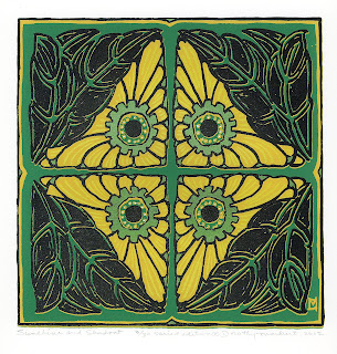
Finishing up my reduction print

green print
I wasn't completely happy with my print of Blossoms and Leaves. The petals of the blossoms were too flat. I decided to add some iridescent "Citrine" to bring more life to them. I cleaned the screen of the four layers of the reduction stencils.
I use "Awsome" that I buy at the dollar store, spray it on, leave the screen horizontal for 15 minutes and then spray with very hot water. I have an extra faucet on my laundry tub that is dedicated to a hose with a garden spray nozzle. I use a strong spray and the screen filler comes away, leaving the screen ready for my next step.
With a print, in register under the screen, I made a drawing fluid and screen filler stencil for some lines on the petals and printed some with the Citrine ink.
purple print
I like the way that they look. The petals on the purple print are darker and more orange that the ones on the green print -there is more contrast. The green print is more subtle.    

Of course, it is no longer a reduction print - which was the idea to start with. I think that I will try again to make a complete reduction print. That is the method that I will be teaching in October at the Power House on the Roycroft Campus.

The first thing that I need to do is to make a strong design for a reduction print - perhaps a landscape.
I'm not sure just what I will do. Maybe in the next few days, I will come up with something.